Summer is the season of longer days, brighter light, fresh air, and more time spent enjoying the spaces we call home. A new paint color is one of the easiest ways to bring that easygoing summer feeling indoors, whether you want to brighten a living room, soften a bedroom, add warmth to a kitchen, or give your porch a seasonal refresh.
This year, summer paint color inspiration is moving beyond the traditional bright coastal look. Homeowners are leaning into warmer, more natural shades including sandy neutrals, soft cream tones, muted blues, sunbaked corals, olive greens, and rich earthy colors that feel relaxed and welcoming.
At Kucker Haney Paint, you can explore Benjamin Moore paint colors that bring summer-inspired warmth and personality to every room in your home.
What Colors Feel Like Summer?
Summer color palettes often take inspiration from the outdoors. Think blue skies, sandy beaches, warm sunsets, garden greenery, weathered wood, and soft sunlight filling a room.
Benjamin Moore’s summer-inspired palette includes sky blues, sandy neutrals, warm peach and coral tones, creamy whites, and rich accent colors that can make a space feel lively without becoming overwhelming.
The key is to choose colors that work with your home’s natural light, furniture, flooring, and existing finishes. A summer paint color does not have to be bright or bold. It can be a soft neutral that makes a room feel lighter, a warm white that reflects the sunlight beautifully, or a muted green that creates a calm, nature-inspired setting.
Sunlit Coral 2170-60 for a Warm Summer Glow
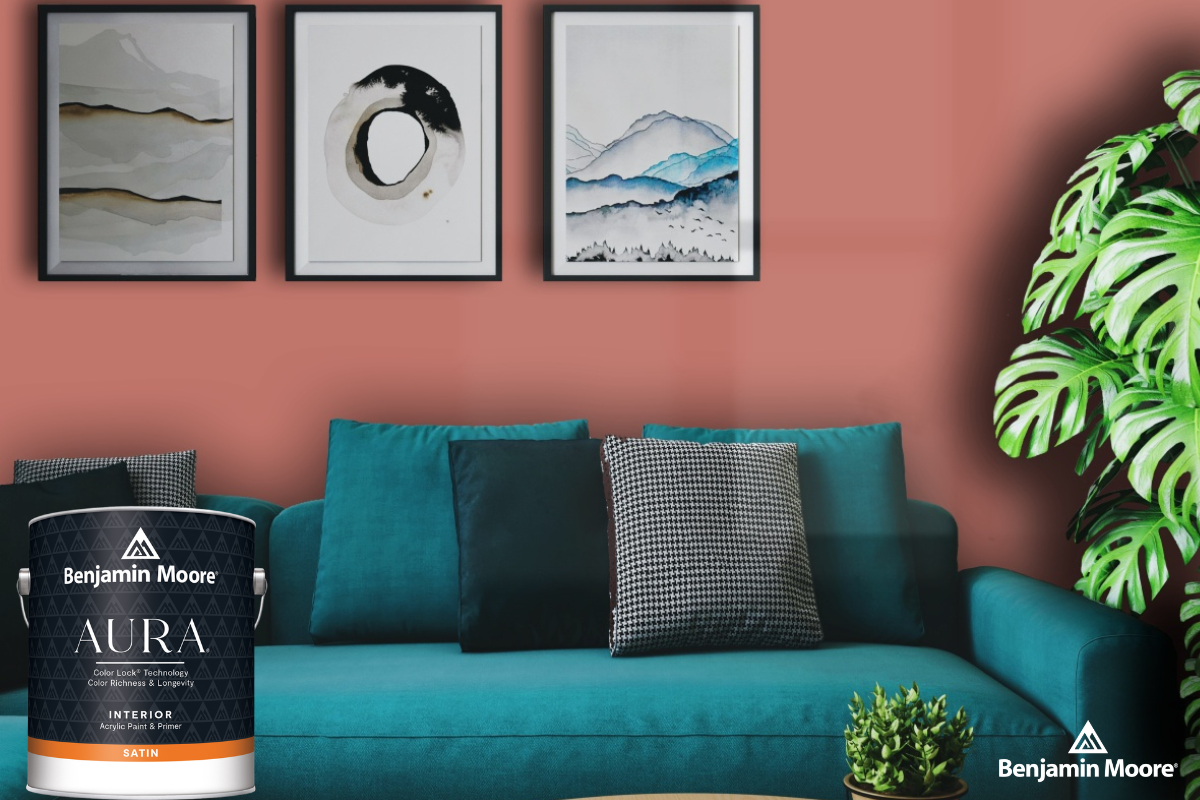
Sunlit Coral 2170-60 is a soft peachy coral that brings warmth and personality into a room. It has a relaxed blend of pink and orange, making it a great option for homeowners who want color without choosing something too intense.
This shade works well in:
- Dining rooms
- Powder rooms
- Bedrooms
- Reading nooks
- Accent walls
- Sunrooms
Pair Sunlit Coral with Cotton Balls OC-122, Sugar Cookie OC-93, or Opulence OC-69 for trim, ceilings, or nearby walls. These lighter companion shades help the coral feel fresh and balanced.
For a summer-inspired room, add natural wood furniture, woven accents, white linens, light curtains, and greenery. The result feels warm, welcoming, and seasonal without looking overly themed.
Cotton Balls OC-122 for a Bright, Breezy White
White paint remains one of the most versatile choices for summer projects, especially in rooms with plenty of natural light. Cotton Balls OC-122 is a soft white with a subtle yellow undertone that gives it a touch of warmth.
This is a great choice for homeowners who want a clean, bright look without the stark feeling that some cooler whites can create.
Use Cotton Balls OC-122 in:
- Living rooms
- Kitchens
- Hallways
- Bedrooms
- Open-concept spaces
- Ceilings and trim
It also works beautifully as a supporting color alongside blue, coral, green, or tan walls. Pair it with Jet Stream 814 for a breezy coastal-inspired palette, Papaya 957 for a warm neutral space, or Sunlit Coral 2170-60 for a cheerful pop of color.
Linen White OC-146 for a Relaxed, Coastal Neutral
Linen White OC-146 is a creamy white that feels softer and more relaxed than a crisp bright white. It is an ideal option for homeowners who want their walls to feel warm, inviting, and easy to live with.
This Benjamin Moore color works especially well in rooms with natural textures, including wood furniture, wicker, jute rugs, linen fabrics, and woven baskets.
Consider Linen White OC-146 for:
- Family rooms
- Bedrooms
- Entryways
- Sunrooms
- Beach-inspired spaces
- Homes with traditional, farmhouse, or transitional décor
Linen White is also a strong choice for homeowners who are moving away from cool gray walls and looking for a neutral that feels warmer and more timeless.
Papaya 957 for a Sandy, Sun-Washed Look
Papaya 957 is a sandy tan with a subtle blush undertone. It has an easygoing, sun-washed quality that works well for homeowners who want more depth than white but still prefer a neutral wall color.
This shade can create a warm backdrop in a room without overpowering the furniture, artwork, or décor. It works especially well with natural wood, textured fabrics, woven materials, black accents, and warm metal finishes.
Papaya 957 is a great option for:
- Living rooms
- Home offices
- Dining rooms
- Guest bedrooms
- Hallways
- Rooms with warm wood flooring
For a softer overall look, pair Papaya 957 with Linen White OC-146, Simply White OC-117, or Mascarpone AF-20 on trim and ceilings.
Farm Fresh AF-360 for a Golden Summer Neutral
Farm Fresh AF-360 is a honey-toned neutral with soft orange undertones. It offers more warmth and presence than a traditional beige, making it a strong choice for homeowners who want a color that feels sunny and grounded.
This shade works well in rooms where people gather, including kitchens, dining rooms, breakfast areas, and family rooms. It can also be used as an accent wall when you want to bring warmth into an otherwise neutral space.
Pair Farm Fresh AF-360 with creamy whites and natural finishes to keep the room feeling balanced. Light wood furniture, woven pendant lights, warm brass accents, and green plants all complement this color beautifully.
Jet Stream 814 for a Breezy Sky Blue
Jet Stream 814 is a bright sky blue that brings the feeling of a clear summer day indoors. It is cheerful, light, and especially effective in rooms where you want to create a calm, airy atmosphere.
This color is a great fit for:
- Bedrooms
- Bathrooms
- Home offices
- Laundry rooms
- Porch ceilings
- Cottage-style or coastal-inspired spaces
One of the best ways to use Jet Stream 814 is on a ceiling. A soft blue ceiling can create the feeling of open sky and add unexpected personality to a room without overwhelming the walls.
Pair Jet Stream 814 with Cotton Balls OC-122, White Diamond OC-61, or Collector’s Item AF-45 for a fresh and polished look.
Wild Flower 2090-40 for a Bold Summer Accent
For homeowners ready to bring more energy into a space, Wild Flower 2090-40 offers a bright, sophisticated red-pink tone. It is a strong accent color that can add personality to furniture, built-ins, doors, or one statement wall.
Wild Flower can work especially well in:
- Dining rooms
- Powder rooms
- Creative workspaces
- Accent walls
- Painted furniture
- Interior doors
Because it is a richer, more expressive shade, balance it with softer neutrals like Parchment OC-78, Atrium White OC-145, or Battenberg AF-70.
A bold color does not have to cover an entire room to make an impact. Try Wild Flower on a small wall, inside a bookcase, on a vanity, or on a piece of furniture that needs a fresh summer update.
Try Summer-Inspired Greens and Earthy Colors
While soft beach-inspired colors remain popular, current summer design trends are also moving toward warmer, more grounded palettes. Olive green, clay, mushroom, muted saffron, dusty blue, and richer wood tones are becoming more common in homes that want to feel natural, comfortable, and personal.
Benjamin Moore colors that work well within this direction include:
- Saybrook Sage HC-114 for a muted, nature-inspired green
- October Mist 1495 for a soft, organic green with a gentle gray undertone
- Revere Pewter HC-172 for a warm greige that works with nearly any room
- Townsend Harbor Brown HC-64 for a rich, earthy brown accent
- Windham Cream HC-6 for a soft butter yellow with welcoming warmth
- Gentleman’s Gray 2062-20 for a deep blue-green statement color
These shades work well with warmer whites, medium wood tones, woven fabrics, textured rugs, and soft neutral furniture.
Summer Paint Ideas for Every Room
Living Room Paint Colors for Summer
A living room should feel comfortable, welcoming, and flexible enough for everyday life. Choose a creamy white like Linen White OC-146 or Cotton Balls OC-122 for a bright foundation. For more warmth, consider Papaya 957 or Revere Pewter HC-172.
If you want a stronger feature wall, a deep blue-green like Gentleman’s Gray 2062-20 can add contrast and sophistication when paired with light furniture and natural wood accents.
Bedroom Paint Colors for Summer
Bedrooms are a great place for colors that feel calm and restorative. Jet Stream 814, October Mist 1495, Linen White OC-146, and soft warm neutrals can make the space feel light and peaceful.
For a more enveloping look, use a deeper paint color on all four walls, then balance it with white bedding, warm lamps, textured pillows, and natural wood furniture.
Kitchen Paint Colors for Summer
Warm whites, creamy neutrals, soft butter yellow, and muted green are especially effective in kitchens. Farm Fresh AF-360 can add welcoming warmth to a breakfast area, while Cotton Balls OC-122 creates a clean backdrop for cabinetry, tile, and open shelving.
For a bolder update, consider painting an island, pantry door, or built-in cabinet in a richer shade such as Gentleman’s Gray 2062-20 or Townsend Harbor Brown HC-64.
Porch and Exterior Accent Colors for Summer
Summer is also a great time to refresh a front porch, shutters, door, or exterior accents. Jet Stream 814 can bring a cheerful blue note to shutters or porch ceilings. A warm white such as Cotton Balls OC-122 can brighten trim, while a coral or deeper blue-green front door can create a memorable entryway.
Always test exterior colors in natural daylight before making a final decision. Sun exposure, landscaping, brick, siding, and roof color can all affect how the paint appears.
Test Your Benjamin Moore Paint Colors Before You Commit
Paint can look very different from one room to another. Before selecting a color, test it on a large sample board or directly on the wall.
Look at the color in the morning, afternoon, and evening. Also consider how it looks under artificial lighting. A warm neutral may look more golden in a south-facing room, while the same color may appear softer or grayer in a north-facing space.
Testing color samples helps you see how undertones work with your flooring, furnishings, countertops, trim, and décor before committing to the full project.
Find Summer-Inspired Benjamin Moore Colors at Kucker Haney Paint
Whether you are updating one room, painting a whole home, refreshing a porch, or creating a colorful accent wall, the right paint color can make your space feel more inviting for summer and beyond.
Visit Kucker Haney Paint in Princeton, East Windsor, or Hamilton to explore Benjamin Moore paint colors, pick up samples, and get help choosing a color palette that works with your home. Our team can help you find the right Benjamin Moore product, sheen, and color for your next summer painting project.