The Best Benjamin Moore Dining Room Colors for Holiday Entertaining create more than a beautiful backdrop for the table. The right color can make a dining room feel warmer, more intimate, and ready for everything from Thanksgiving dinner to holiday parties and quiet winter gatherings.
Dining rooms are one of the best places in the home to experiment with richer color. Unlike a living room, which may be used throughout the day, a dining room is often designed specifically for gathering, making deeper greens, warm browns, jewel tones, and sophisticated neutrals especially effective.
Benjamin Moore’s 2027 Color Trends palette is particularly well suited to holiday entertaining. The collection combines warm, welcoming neutrals with confident mid-tone colors that feel classic enough to live with well beyond the holiday season.
What Are the Best Benjamin Moore Dining Room Colors for Holiday Entertaining?
A successful holiday dining room should feel inviting in both daylight and evening lighting. Candlelight, chandeliers, sconces, and warm decorative lighting tend to make deeper and warmer paint colors feel especially rich.
Some of the strongest Benjamin Moore choices include Webster Green HC-130, Townsend Harbor Brown HC-64, Antique Copper 1169, Shakespeare Tan 228, White Down OC-131, Durango 2137-30, Hale Navy HC-154, and Barista AF-175.
The best choice depends on whether you want a dramatic, traditional, rustic, elegant, or light, neutral look.
Webster Green HC-130 for a Classic Holiday Dining Room
Webster Green HC-130, Benjamin Moore’s Color of the Year 2027, is an excellent choice for a dining room designed for entertaining. It is a confident mid-tone green that feels traditional without looking dated.
Green naturally works well during the holiday season, but Webster Green has enough depth and sophistication to work year-round. Pair it with warm wood furniture, brass lighting, cream linens, and natural greenery for a layered, collected look.
For a more dramatic approach, you can also use Webster Green on trim, wainscoting, built-ins, or even the ceiling while keeping the remaining surfaces lighter.
Townsend Harbor Brown HC-64 for a Rich, Elegant Look
Townsend Harbor Brown HC-64 is a grounded burgundy-brown that creates a warm, intimate atmosphere.
This color works particularly well in dining rooms used primarily in the evening. Under warm lighting, the red and brown undertones become richer and create a sophisticated backdrop for holiday tablescapes.
Pair it with cream-colored trim, antique brass, dark wood furniture, and greenery for a traditional holiday look. It can also work beautifully with more modern furnishings when paired with simple lighting and minimal decor.
Antique Copper 1169 for Warmth and Character
Antique Copper 1169 brings warm, spiced undertones into the dining room. It works especially well with wood dining tables, leather accents, woven textures, and warm metallic finishes.
This color can make a room feel cozy without becoming overly dark. For holiday entertaining, it provides a beautiful backdrop for ivory dinnerware, evergreen branches, burgundy accents, and candlelight.
Antique Copper is also a strong option for homeowners who want warmth but prefer something less traditional than red or forest green.
Shakespeare Tan 228 for a Warm Neutral Dining Room
Not every holiday dining room needs a dramatic wall color. Shakespeare Tan 228 offers a golden neutral that can make a dining space feel warm, comfortable, and polished.
It works particularly well in rooms with traditional wood furniture, warm flooring, or brass fixtures. Because it is lighter than many of the deeper holiday-inspired shades, it can also help smaller dining rooms feel open while still providing warmth.
Pair Shakespeare Tan with White Down OC-131 on the ceiling or trim for a soft, coordinated palette.
White Down OC-131 for a Light and Elegant Dining Room
White Down OC-131 is a cozy off-white that can create an elegant backdrop for holiday decorating.
A lighter dining room allows the table, artwork, lighting, and seasonal decor to become the focal points. White Down works especially well with natural wood, green garlands, brass candlesticks, dark chairs, and textured linens.
It can also be paired with a darker painted buffet, built-in, fireplace, or accent wall to create contrast without making the entire room feel dark.
Durango 2137-30 for a Dramatic Dining Room
Durango 2137-30 is a deep neutral with olive undertones that creates a moody, sophisticated dining space.
It pairs especially well with warm woods, black accents, cream upholstery, and brass or bronze lighting. For holiday entertaining, its olive tone provides a natural connection to evergreen decor without feeling overly seasonal.
This is a strong choice for a dining room where the goal is an intimate, restaurant-like atmosphere.
Hale Navy HC-154 for a Timeless Dining Room
Hale Navy HC-154 remains one of Benjamin Moore’s most versatile colors for dining spaces. Its deep navy tone can create drama while still feeling classic and familiar.
Hale Navy works beautifully with white trim, warm wood furniture, brass fixtures, and lighter upholstery. It can also be used on a fireplace mantel, built-in cabinetry, wainscoting, or an accent wall if painting the entire room feels too bold.
For holiday entertaining, navy provides an elegant backdrop for gold, silver, red, green, and white table settings.
Barista AF-175 for a Cozy Holiday Dining Room
Barista AF-175 is a rich brown that can make a dining room feel grounded and intimate. It works particularly well as an accent wall or in a room with creamy walls and trim.
Brown tones pair naturally with wood furniture, candlelight, evergreen decorations, and warm metallic, making Barista an easy fit for fall and winter entertaining.
It is also a useful alternative for homeowners who want a darker room but do not want black, navy, or green.
Should a Dining Room Be Dark or Light for Holiday Entertaining?
Both can work well, but they create different moods.
Darker colors such as Webster Green, Townsend Harbor Brown, Durango, Hale Navy, and Barista tend to make a dining room feel more intimate and dramatic. They work especially well in rooms used for evening dinners and entertaining.
Lighter shades such as White Down and Shakespeare Tan create a softer, more flexible backdrop. These colors can be especially effective in smaller dining rooms or spaces that open directly into a kitchen or living room.
If the dining room connects to another room, the colors should relate even if they are not identical. Similar undertones or repeated accent colors can help create visual flow.
How Can an Accent Wall Add Drama to a Dining Room?
Dining rooms are well suited to accent walls because they often have a clear focal point, such as a buffet, fireplace, artwork, or dining table.
A deeper color behind a sideboard or fireplace can add dimension without committing to dark walls throughout the entire room. Webster Green HC-130, Hale Navy HC-154, Barista AF-175, or Durango 2137-30 can all work well for this approach.
Another option is to use the deeper color on wainscoting or trim and keep the upper walls lighter. This creates architectural interest while allowing the dining room to remain bright.
How Should Lighting Affect Dining Room Paint Color?
Dining rooms often look very different at night than they do during the day, so lighting should play an important role in color selection.
Warm chandeliers, sconces, and candlelight can enhance reds, browns, greens, and golden neutrals. Cooler lighting can make some warm colors appear flatter or more muted.
Before choosing a final color, test samples on more than one wall and view them in both daytime and evening light. The goal is to choose a shade that looks attractive under the lighting you use most often when entertaining.
What Paint Finish Is Best for Dining Room Walls?
For dining room walls, eggshell or matte are both strong choices.
Eggshell provides a subtle sheen and offers enough durability for occasional cleaning, making it a practical choice for most dining rooms. Matte provides a softer, more sophisticated appearance and can look particularly elegant with deeper colors.
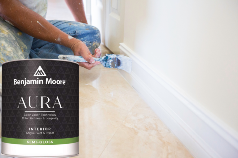
For trim, doors, wainscoting, and built-ins, satin or semi-gloss can create contrast and make architectural details stand out.
Benjamin Moore Aura Interior Paint is an excellent option for dining rooms where rich color depth and durability are important.
How Can Holiday Decor Work With the Wall Color?
The paint color should provide a backdrop rather than compete with the holiday decorations.
Deep green walls work beautifully with brass, cream, natural wood, and white accents. Burgundy and brown shades pair well with greenery, warm metallics, and candlelight. Navy provides a sophisticated backdrop for gold, silver, white, and traditional red accents.
Lighter neutral rooms allow more freedom with colorful table linens, wreaths, garlands, and seasonal centerpieces.
Natural materials such as wood, linen, greenery, dried branches, and woven textures work with nearly every Benjamin Moore dining room palette and help keep the space feeling warm rather than overly themed.
Visit Kucker Haney Paint for Holiday Dining Room Color Inspiration
The best Benjamin Moore dining room colors for holiday entertaining should make the room feel welcoming during special gatherings while still working beautifully year-round.
From the timeless green of Webster Green HC-130 to the warmth of Antique Copper 1169, the elegance of Townsend Harbor Brown HC-64, and the softness of White Down OC-131, you can create a dining room that feels ready for the season.
Visit Kucker Haney Paint in Princeton, East Windsor, or Hamilton to explore Benjamin Moore colors, compare paint samples, and find the right paint, finish, brushes, rollers, and supplies for a holiday dining room refresh.